Explore 20 types of graphic organizers for teachers, each with a free, ready-to-use example you can open, edit, and download for your class today.
Graphic organizers for teachers come in more shapes than most of us use in a given week. At their simplest, they are visual layouts that help students take an idea and sort it onto something they can see and fill in, like two overlapping circles for comparing, or a row of boxes for the order of events in a story. We reach for them in reading, writing, science, and review, at just about every grade.
The catch is that they are not interchangeable. The right one depends on the kind of thinking you want students to do, and finding it is only half the job. Most of us then search Pinterest or TPT, land on something close enough, and spend a while adapting it to our grade and our lesson. If that sounds familiar, you're in good company. It's just how teachers have sourced these for years.
The good news is you can skip the rebuild. Below are 20 of the most useful types of graphic organizers, grouped by what they help students do, and each one comes with a free, ready-to-use example you can open, edit, and download – or just use a purpose-built AI graphic organizer generator.
A graphic organizer is a visual layout that takes an idea or a text and breaks it into parts students can see and fill in. It might be two overlapping circles for a comparison, a row of boxes for the order of events in a story, or a web with a word in the middle and its meaning branching off it. In each case, the shape is really the thing doing the teaching. It shows students how the pieces fit together before they have to put any of it into full sentences.
Think about the last time you asked a class to compare two things, say cats and dogs. Ask for it cold and you get a few quick hands and a lot of stalled pencils. Hand the same class a Venn diagram and the task changes, because now there is a spot for every kind of answer:
Left circle, cats only: retractable claws, purrs, often happy on its own. Right circle, dogs only: barks, wags its tail, loves a walk. The middle, both: mammals, have fur, four legs, kept as pets.
The student who had nothing to say a minute ago now has somewhere to put the first thing they notice, and one noticing leads to the next.
We reach for them because thinking is invisible, and a blank page is hard to start. A student can tell you all about a character out loud and then freeze the minute it's time to write it down. A story map or a character web gives that thinking somewhere to land. And once the parts are on the page, the writing and the talking tend to come a lot easier.
They earn their keep as a quick check too. Glance at a filled-in KWL chart or a main idea and details sheet and you can see in a few seconds who has it and who needs another go, without grading a thing.
All of that is the easy part, though. Picking the right one is where it gets harder, and that's where we're headed next.
Twenty types is a lot to scroll through when you've got a lesson to teach on Thursday. But you don't really pick by the chart. You pick by the job. So decide what kind of thinking you want students to do first, then choose the layout that holds it.
.gif)
You already do this, really, even if you've never said it out loud. When a class needs to weigh two characters, you reach for something with two sides. When they need to retell a story in order, you reach for boxes and arrows. One way or another, the task picks the shape.
Almost everything sorts into six jobs:
If you just want the ones you'll reach for most weeks, the Venn diagram, KWL chart, story map, concept map, and T-chart cover a big share of everyday classroom use. If you're newer to this, I'd start there.
The table below maps all 20 to the thinking task they fit and the grade band where they tend to start working well. Grade is a starting point, not a rule, since you can shift any organizer up or down a band in one click later.
So find the row that matches what you're teaching, note its number, and jump to it below. And before the types start, the next short section covers how the free examples actually work.
The 20 types below are grouped by use case, and every one is laid out the same way. Once you've read through a single entry, you'll know how to skim the rest: what it is, what it's best for, a finished example, and a link to grab that example. And the example isn't just a picture of a template. It's a real organizer, already filled in, that you can open and make your own.
That last part is the one worth knowing before you start clicking. Each example is a live Monsha resource, so getting your own editable copy only takes a couple of clicks. Here's how it works:
And it's free! You won't need a credit card to do any of it. If you'd rather start from a blank one and build it up yourself, here's the full walkthrough on how to create graphic organizers with AI.
You can try it below, just enter your requirements and hit Generate.
Hopefully one of these saves you a prep period this week.
Comparing two things is one of the most common things we ask students to do, and one of the easiest to ask badly. Tell a class to compare frogs and toads with nothing in front of them, and you tend to get a long list of differences and not one similarity. And why is that? Well, differences are easy to spot. Likeness takes a second look, and that second look is really the whole point.
All three layouts below do basically one job. They hold two things side by side, so the similarities and the differences both have somewhere to land. Where they differ is in how much detail they ask for. These are the first three of the twenty.
Two overlapping circles, and that's about it. Whatever is unique to each thing goes in its own circle, and whatever the two share goes in the overlap in the middle. It's the default tool for comparing two things, from about K-2 on up, in any subject where two things sit close enough to get mixed up.
Example
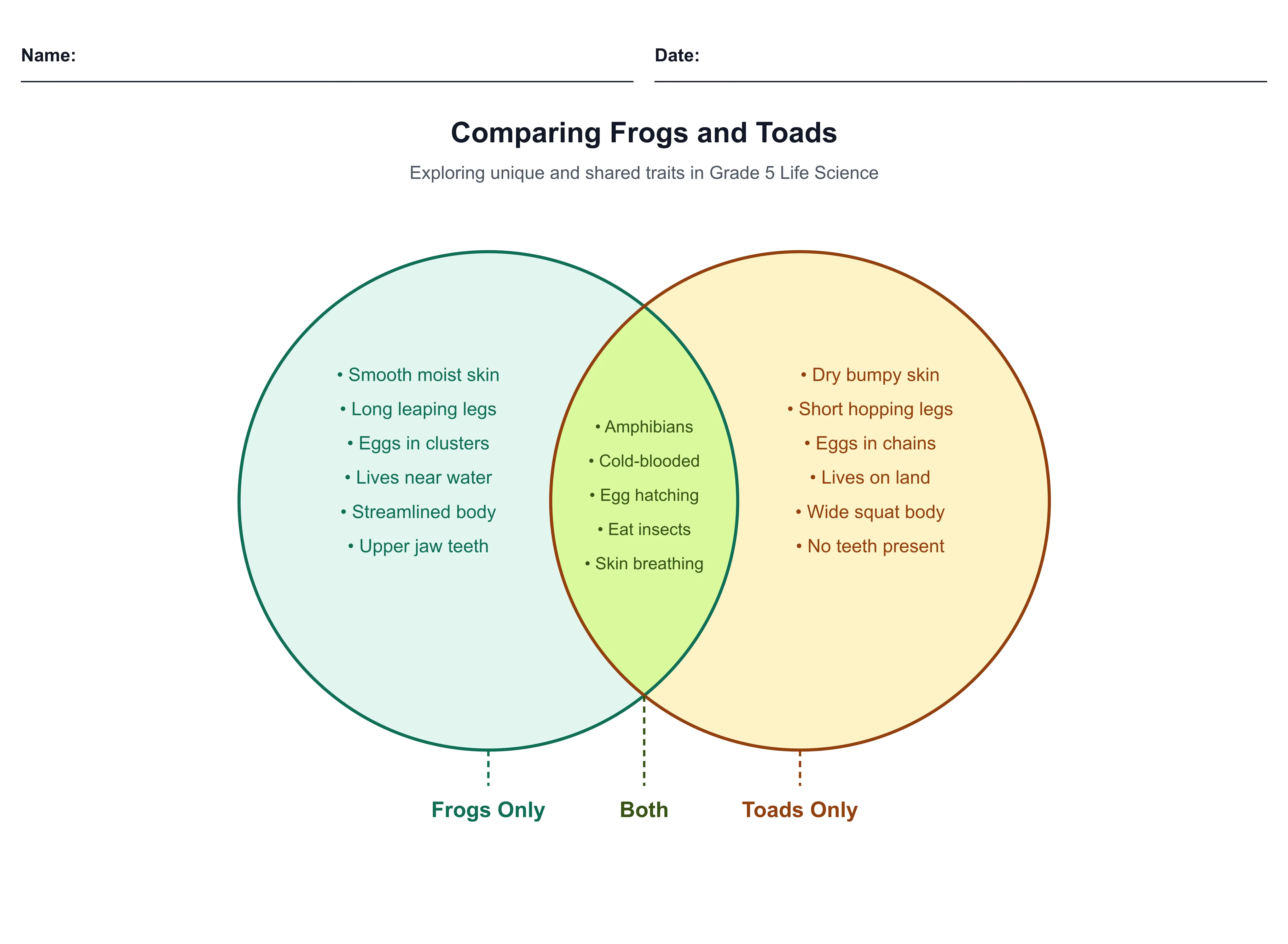
Here's a finished Venn comparing frogs and toads, with the shared traits gathered in the middle.
Get this template
Open the frogs-and-toads example and make it your own, then swap in whatever two things your class is comparing this week. You can shift the grade band or pull a blank version for students in a click.
How to use a Venn diagram
Benefits of a Venn diagram
Grade levels and subjects
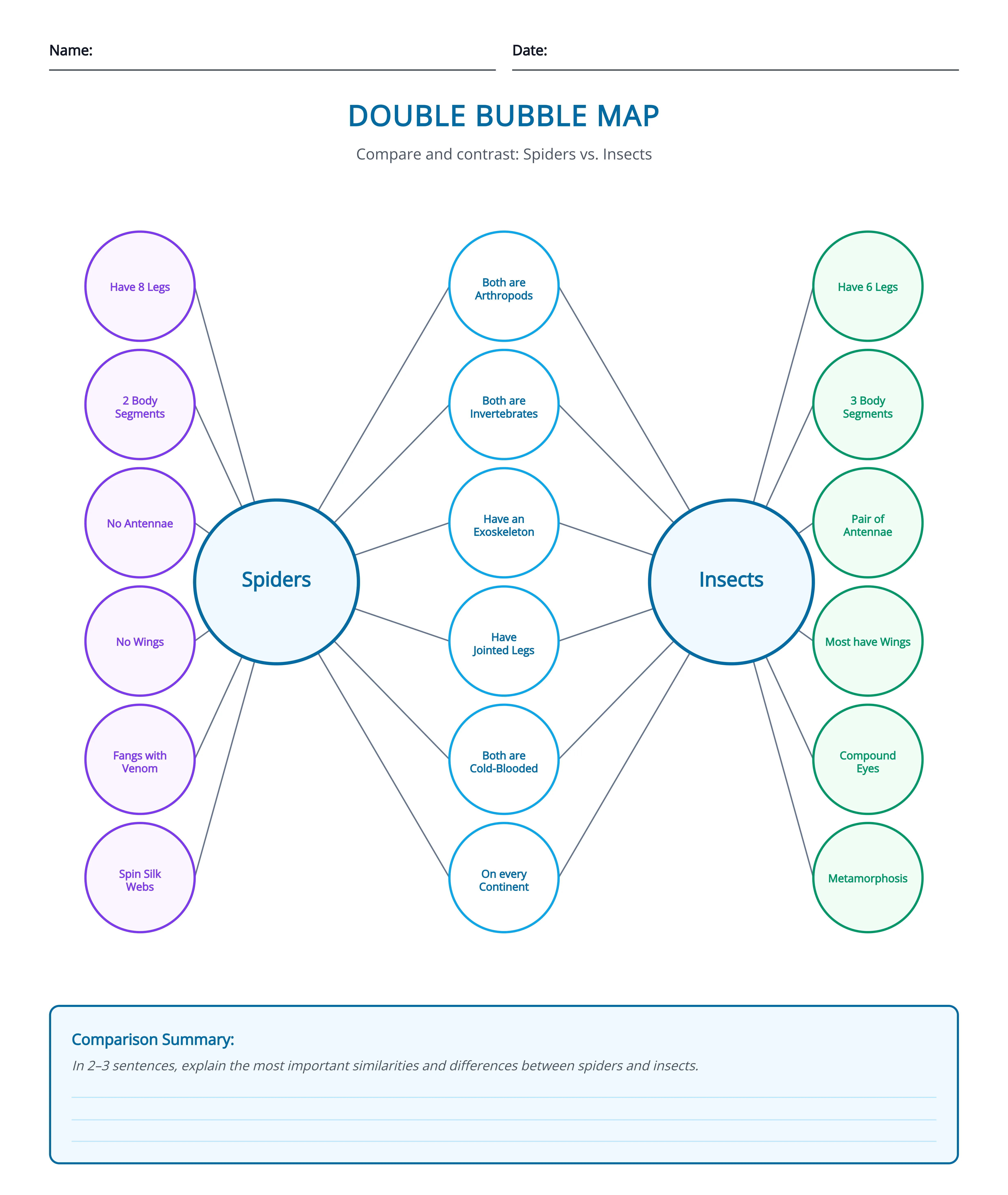
Think of it as a Venn with more room to think. The two topics sit in the middle, the traits they share connect to both, and the traits unique to each branch off the outside. It comes from Thinking Maps, and it's best for trait-heavy comparisons where you want each similarity and difference named in its own bubble instead of crowded into one overlap.
Example
Below is a double bubble comparing spiders and insects, the shared traits bridging the two and the differences branching off each side.
Get this template
Grab the spiders-and-insects map and change the two topics to match your unit. If your class needs it in another language, you can translate the whole thing at once.
How to use a double bubble map
Benefits of a double bubble map
Grade levels and subjects
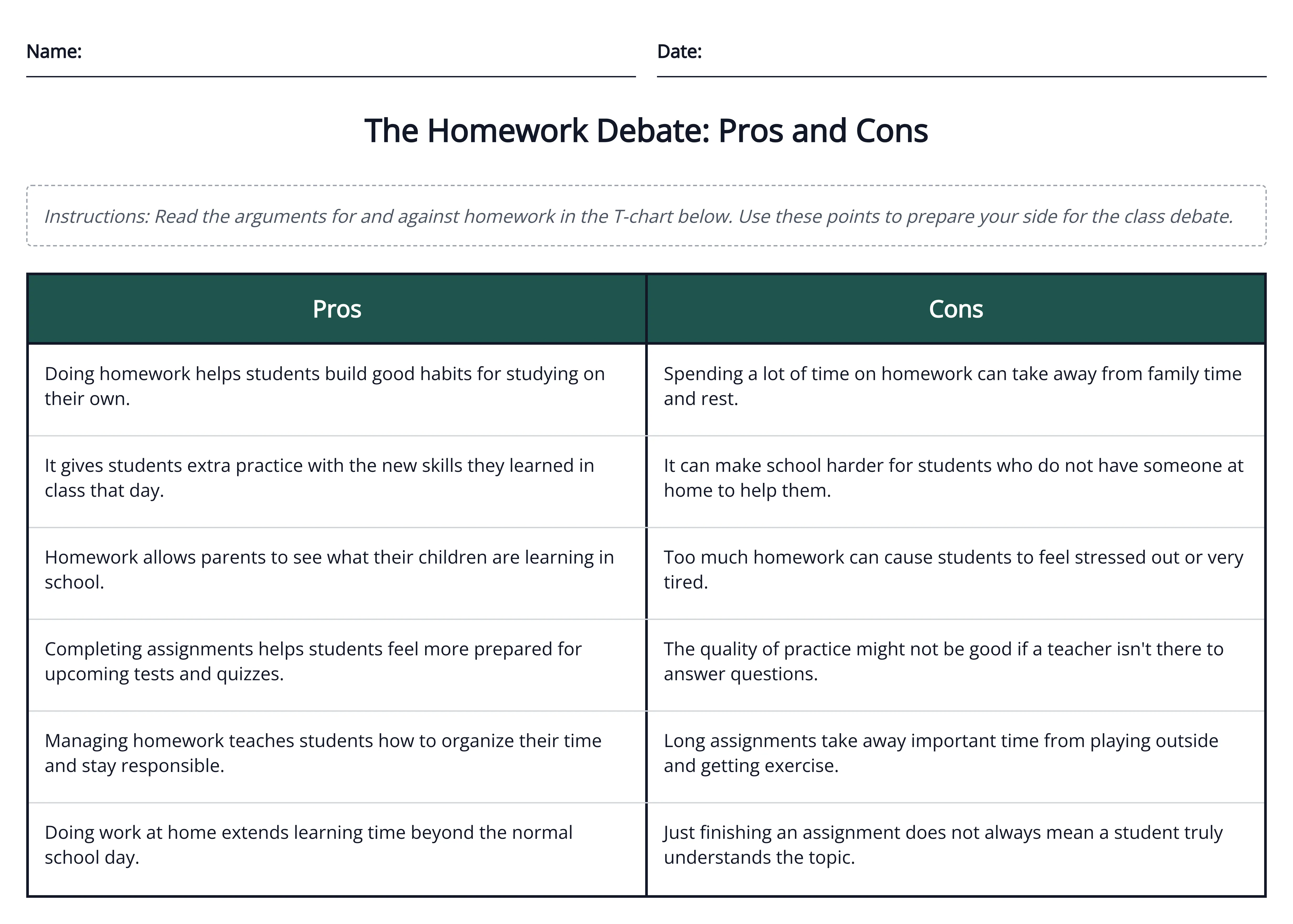
This is the simplest of the three. Just two columns under a heading, with no overlap at all. It asks students to sort one side against the other, which makes it a good first comparison tool at any grade: pros and cons, fact and opinion, before and after.
Example
This one's a T-chart laying out the pros and cons of homework, one argument per row on each side.
Get this template
Take the homework T-chart and retype the two headers for any sort you need, then add an answer key if you want one to hand back.
How to use a T-chart
Benefits of a T-chart
Grade levels and subjects
So these three all keep two things side by side. But when what matters is the order things happen in, or what caused what, the shape has to change. And that group is up next.
Ask a class what caused something, a war, a character's choice in a story, and a fair number of students hand you back whatever happened right before it. Order and cause can really look like the same thing from a student's seat. And the hard part isn't naming the events. It's spotting that one of them set the next one going, then laying that out so it holds together.
So these four layouts split the work two ways. Two of them put events in order, where the order is the lesson. The other two trace cause, where the point is how one thing leads to the next. Pick the pair that fits what you're after, then the layout inside it.
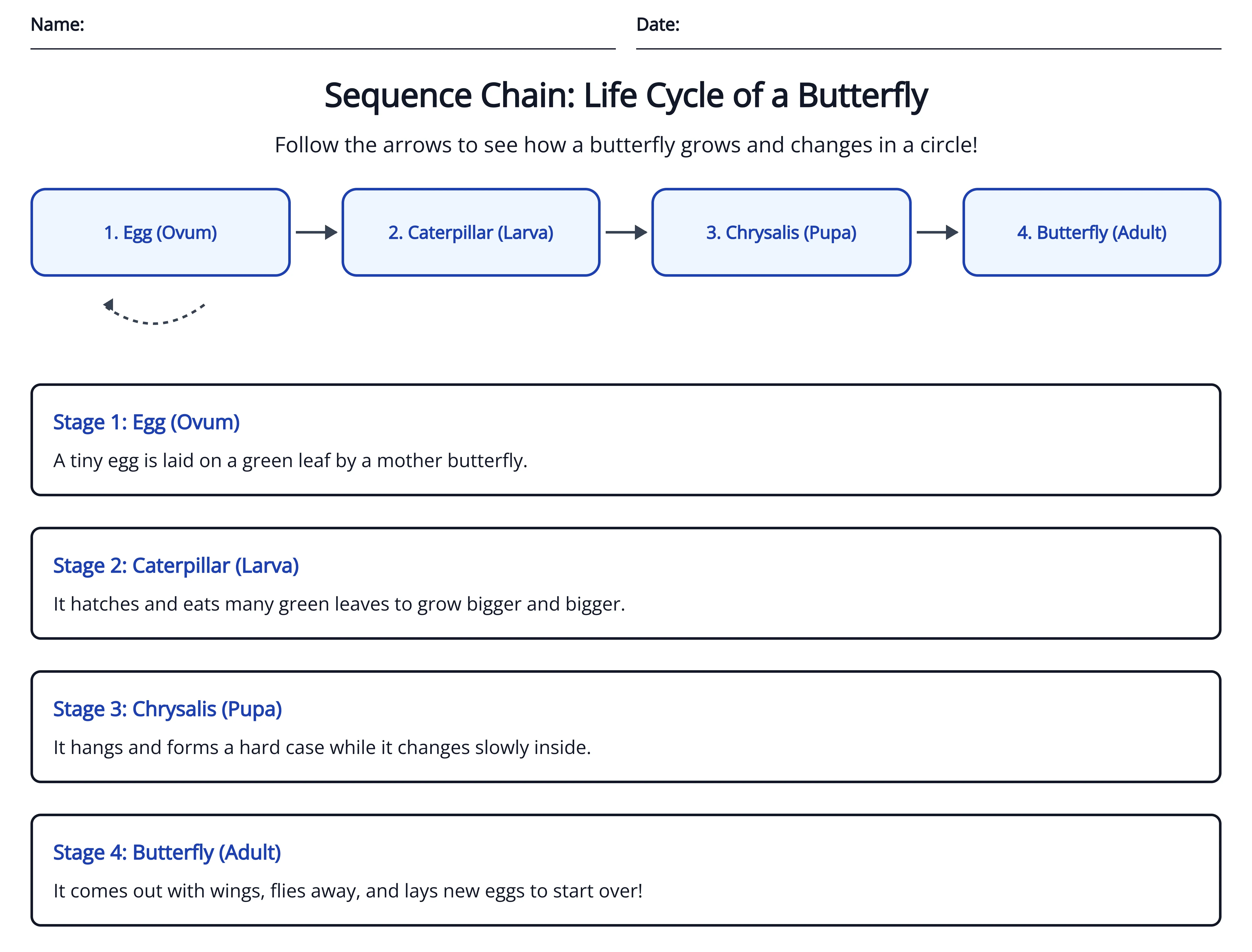
It's a row of boxes joined by arrows, one step or event per box, read left to right. Best for putting things in order, from K-2 on up, in any process where the order itself is the point.
Example
Here's one for the life cycle of a butterfly, a stage per box from egg to adult.
Get this template
Open the butterfly life-cycle chain and swap in whatever process your class is working on this week. If it reads a little high, you can simplify the wording for a younger group in a click.
How to use a sequence chain
Benefits of a sequence chain
Grade levels and subjects
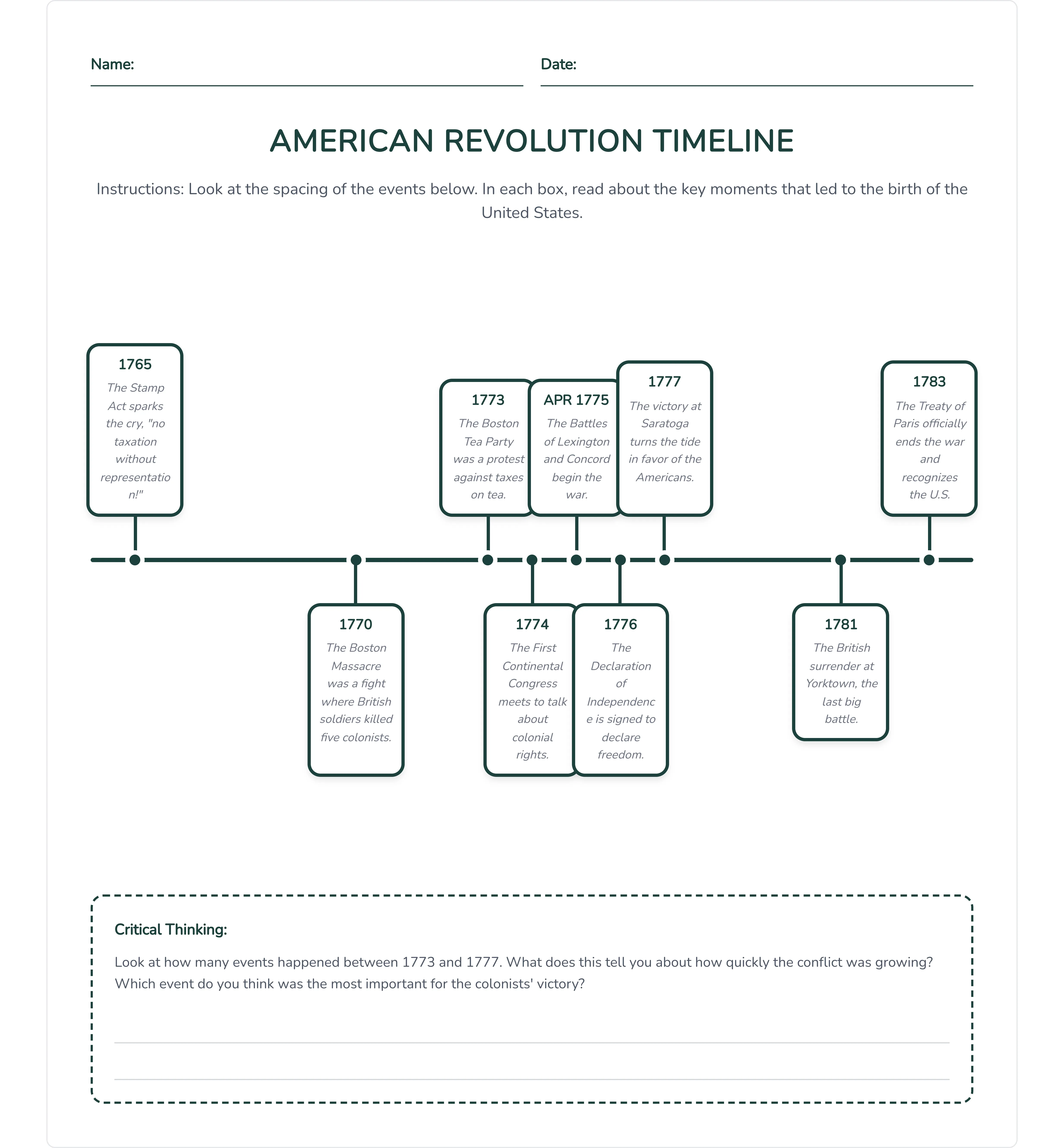
Events placed along a single line in the order they happened, usually with their dates. It's best for dated sequences, from about 3-5 up, where the gaps between events matter just as much as the order.
Example
Below is a timeline of the key events of the American Revolution, spaced along the line by date.
Get this template
Grab the American Revolution timeline and change the events to the period you're teaching. When it's ready, you can send it straight to Google Classroom for the whole class.
How to use a timeline
Benefits of a timeline
Grade levels and subjects
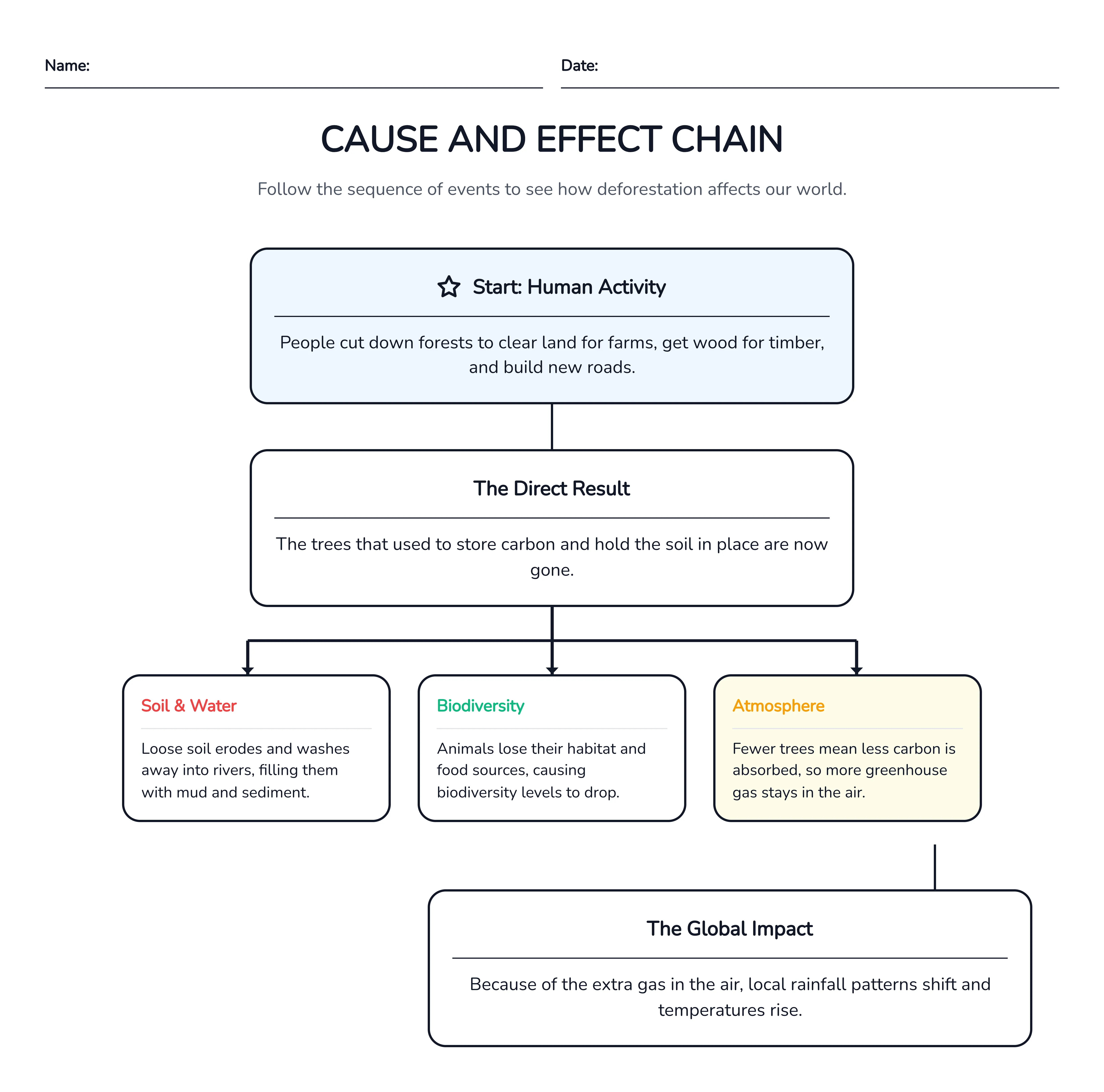
Cause boxes pointing to effect boxes, so students can see how one thing leads to another. And often an effect becomes the next cause, so the chain keeps going. It's best for tracing cause, from 3-5 up, in science and reading alike.
Example
This one follows the causes and effects of deforestation, each cause linked to what it leads to.
Get this template
Take the deforestation chain and point it at your own topic. Getting started is usually the sticking point for students, so you can add sentence starters to give them a way into each box.
How to use a cause-and-effect chain
Benefits of a cause-and-effect chain
Grade levels and subjects
Picture a spine with the outcome at the head and bones branching off it, one for each category of cause. It sorts a pile of causes by type, which makes it best for deeper causal work, from about 6-8 up, when one outcome has more causes than a simple chain can hold. Fair warning, it asks more of students than the other three.
Example
Here's a fishbone sorting the causes behind the fall of the Roman Empire, one category per bone.

Get this template
Open the Roman Empire fishbone and rework it for whatever outcome your class is unpacking. Once it looks right, you can download it as a PDF to print.
How to use a fishbone diagram
Benefits of a fishbone diagram
Grade levels and subjects
Order and cause sit under a lot of what we teach, and these four put them somewhere students can actually point to. Stories run on both, of course, which is right where the next group of organizers goes to work.
Reading is where graphic organizers do the most work, which is partly why this is the longest group in the article. A student can read every page of a book and still go quiet when you ask what it was about. Because reading the words and reading the story just aren't the same job. One asks them to decode the sentences. The other asks them to hold the setting, the characters, the problem, and the way it all changes, all in their head at once, and then say something about it.
So these five layouts each take one piece of that load off. Two of them break a whole story into its parts, one boils a story down to a single summary sentence, one digs into a character, and one pulls the main point out of a passage. Find the reading job you're working on this week and grab the one that fits.
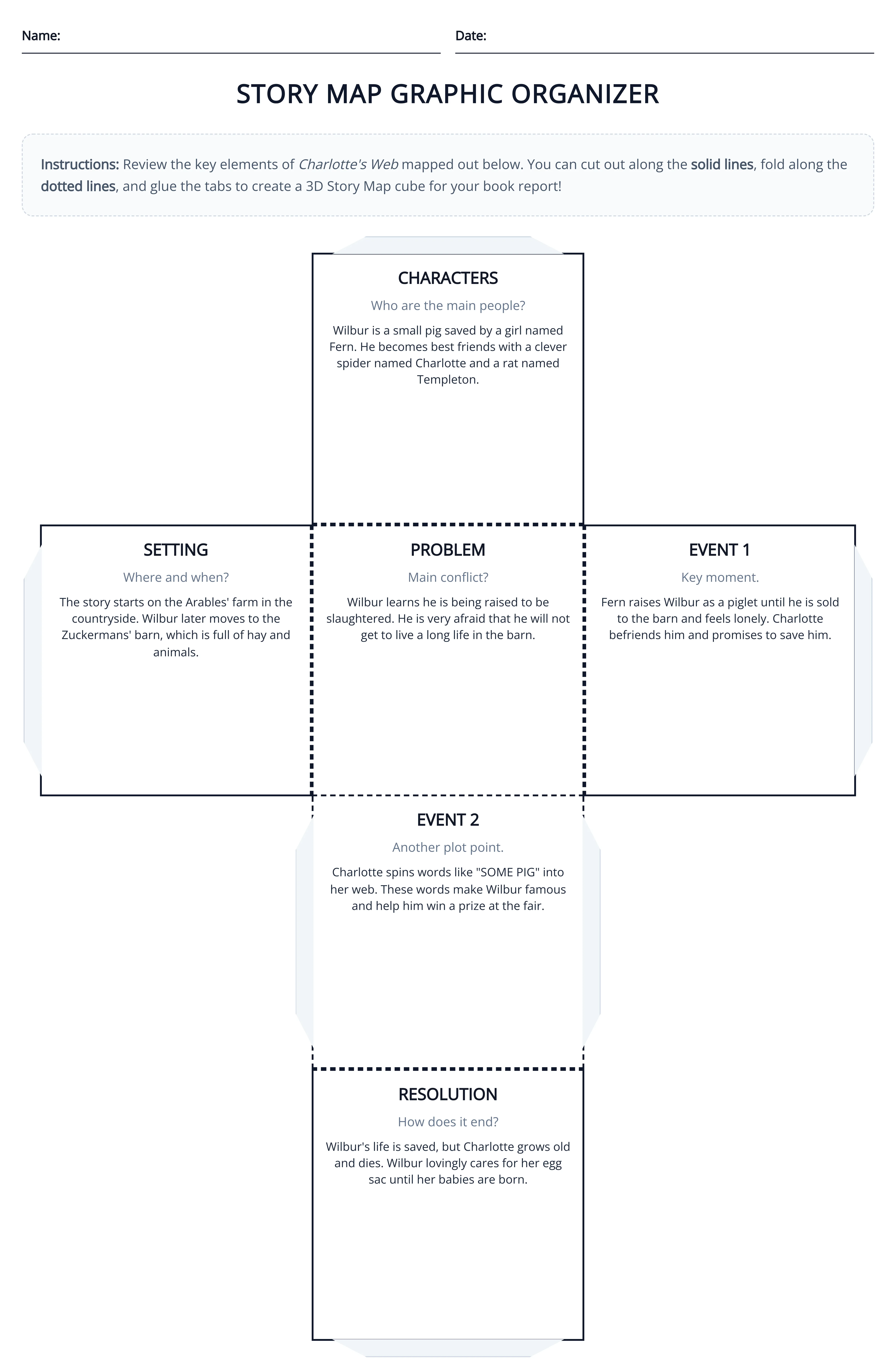
It's a labeled map of one story: its setting, its characters, the problem the story turns on, the main events, and how it all gets resolved. The core narrative breakdown, really, good from K-2 on up, anytime you want students to see a whole story as a set of parts instead of one long blur of plot.
Example
Here's a story map of Charlotte's Web, with the setting, the characters, the problem, and the events that lead to the ending each in their own space.
Get this template
Open the Charlotte's Web story map and swap in whatever your class is reading. If you're using it with older students, you can add detail so there's more to fill in than the basic five parts.
How to use a story map
Benefits of a story map
Grade levels and subjects
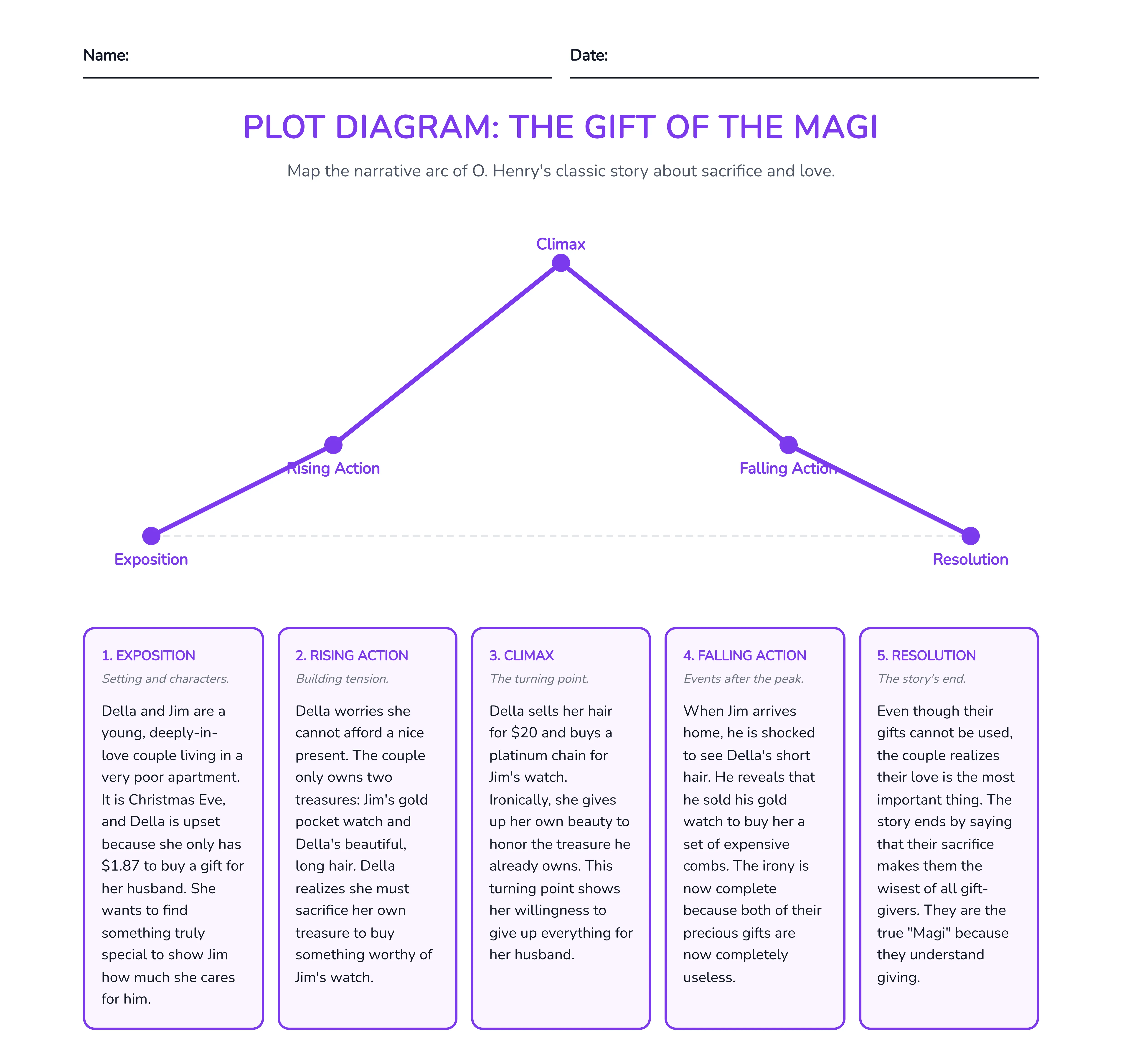
This one lays a story out along its arc: exposition at the start, rising action building to the climax, then falling action and the resolution. Where a story map sorts a story into parts, a plot diagram shows the shape of the tension, which makes it best from about 3-5 up, once students are ready to talk about why a story builds and breaks the way it does.
Example
Below is a plot diagram of The Gift of the Magi, the rising action climbing to the twist and easing into the resolution.
Get this template
Take the Gift of the Magi plot diagram and point it at the story you're teaching. If the same class would do better breaking the story into parts first, you can switch it to a story map without retyping a thing.
How to use a plot diagram
Benefits of a plot diagram
Grade levels and subjects
It's a five-part frame that boils a story down to a sentence or two: Somebody, Wanted, But, So, Then. The student names the character, what they wanted, the problem that got in the way, what they did about it, and how it ended. Probably the fastest summary tool of the bunch, best from 3-5 up for teaching students to summarize without retelling every page.
Example
This one's an SWBST of Cinderella, the five parts filled in to sum up the whole story in a line.

Get this template
Grab the Cinderella SWBST and change the story to match your reading. When you're done you can download it as a Word doc to drop straight into a reading packet.
How to use an SWBST organizer
Benefits of an SWBST organizer
Grade levels and subjects
Picture a character's name in the center, with their traits branching off, and each trait backed by evidence from the text. It pushes students past "she's nice" to the line in the book that proves it, which makes it best from 3-5 up, once you're asking for character analysis with support rather than opinion.
Example
Take a look at this character traits web for Auggie from Wonder, each trait paired with a moment from the book that backs it up.
_%20Character%20Traits%20Web%202026-06-21%20by%20Monsha.webp)
Get this template
Open the Auggie character web and switch the character to whoever your class is reading about. You can export it as an image to drop onto a slide or project on the board while the class works through the evidence together.
How to use a character traits web
Benefits of a character traits web
Grade levels and subjects
The main point sits at the top, with the supporting details branching below it, usually for a nonfiction passage. It's the backbone of informational reading, good from K-2 on up, anytime students need to tell the one big idea apart from the facts that hold it up.
Example
This one lays out the main idea of a short passage on why honeybees matter, with the supporting details branching beneath it.

Get this template
Take the honeybees main-idea organizer and paste in the passage your class is reading instead. Once it's filled in, you can send it to Google Docs to share with the class or keep editing it there.
How to use a main idea and supporting details organizer
Benefits of a main idea and supporting details organizer
Grade levels and subjects
Between them, these five cover most of what we ask of a reader: break a story into parts, boil it down, get inside a character, and pull the point out of a passage. Get the right one in front of a class, though, and the talk about a book shifts from what happened to why it happened. That's the part worth teaching, and it's a lot easier to reach when students aren't staring at a blank page to get there.
The reading organizers in the last group help students pull a text apart. These two do the reverse. They help a student build something that isn't on the page yet, and that's usually the harder ask. Think of the kid who can talk your ear off about a weekend or a video game and then writes three flat sentences the minute you hand them lined paper. The ideas are clearly in there. So where does the writing break down? Usually not in what they have to say. It's the shape to put it in.
And that's exactly what these two layouts give a student. The shape, before the writing starts. A hamburger organizer maps a single paragraph, and a five-paragraph plan maps a whole essay. Both turn getting started from a stare at a blank page into filling one box at a time, which is the stall I've watched trip up more writers than any missing idea ever has. So pick the one that fits what your class is drafting this week.
It's a paragraph drawn as a hamburger: the top bun is the topic sentence, the fillings in the middle are the supporting details, and the bottom bun is the closing sentence. The standard way to teach single-paragraph structure, good from about K-2 on up, once students are putting sentences together into a paragraph and need to see that a paragraph has a top, a middle, and an end.
Example
Below is a hamburger organizer for a paragraph on why recess matters, the topic sentence in the top bun and three reasons stacked in the middle.

Get this template
Open the why-recess-matters hamburger and swap in your own paragraph topic. Getting going is where a lot of young writers stall, so you can add sentence starters that hand students the first few words of each part.
How to use a hamburger paragraph organizer
Benefits of a hamburger paragraph organizer
Grade levels and subjects
This is a plan for a whole essay laid out paragraph by paragraph: an introduction with the thesis, three body paragraphs that each carry their own point, and a conclusion, with a prompt in every box. It scaffolds the jump from one paragraph to a full essay, best from about 3-5 up, once students are ready to hold an argument across several paragraphs.
Example
Here's a five-paragraph essay organizer planning an argument on whether the school day should start later, the thesis up top and one point filled into each body paragraph.

Get this template
Take the later-school-start essay organizer and change the prompt to whatever your class is writing about. When the plan's ready, you can send it to OneDrive as a Word doc so students can draft straight from it.
How to use a five-paragraph essay organizer
Benefits of a five-paragraph essay organizer
Grade levels and subjects
Give students the shape, and a good chunk of the blank-page panic goes quiet. The other half of the job, though, is the words, the right term for the idea a student is reaching for. Building that vocabulary is its own work, and it's where this article heads next.
Every word a student writes, they're either landing on the right term or settling for a near miss. A kid can recite the definition of "metaphor" on Monday and still not use the word in their own writing by Friday. There's a real gap between defining a word and owning it, and most vocabulary work lives in that gap.
So these three layouts work it from different angles. A Frayer model pulls a single term apart until a student owns it. A picture-word chart ties a word to an image and a sentence so it sticks. And a concept map zooms out to show how a whole set of ideas connect. Pick the one that fits whether you're building one word or a web of them.
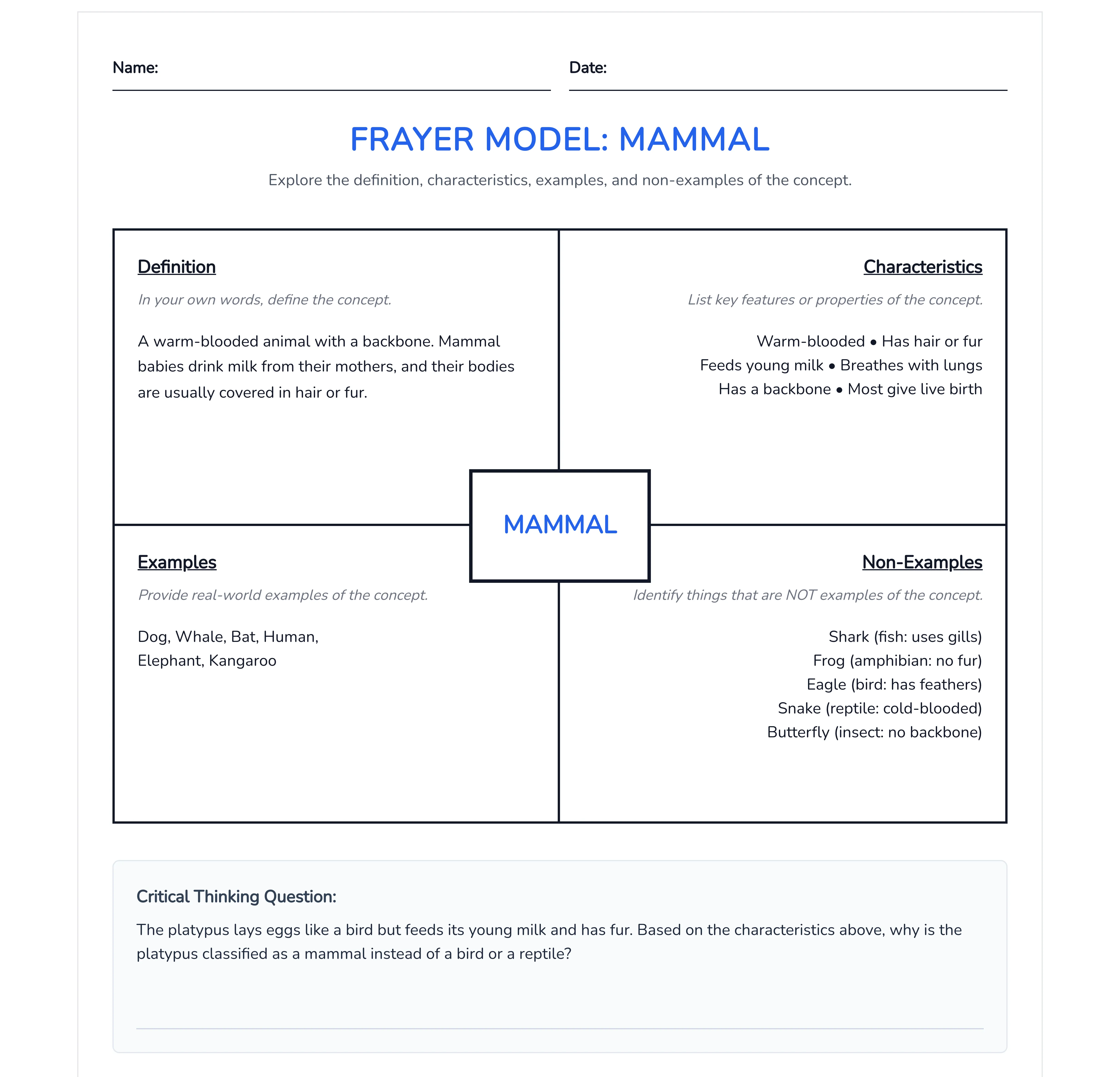
It's a single term in the center, boxed in by four parts: a definition, the word's characteristics, examples, and non-examples. The non-examples are what really set it apart. Why bother with what a word isn't? Because ruling things out forces a sharper line around what it is. It's a vocabulary staple from about 3-5 up, anywhere a term is worth slowing down on, in science, math, and social studies alike.
Example
Here's a Frayer model for the word "mammal," the definition and characteristics up top and clear examples and non-examples filling the lower boxes.
Get this template
Open the mammal Frayer model and drop in whatever term your unit turns on. You can add an answer key version so there's a model of a strong response to hold student work against.
How to use a Frayer model
Benefits of a Frayer model
Grade levels and subjects
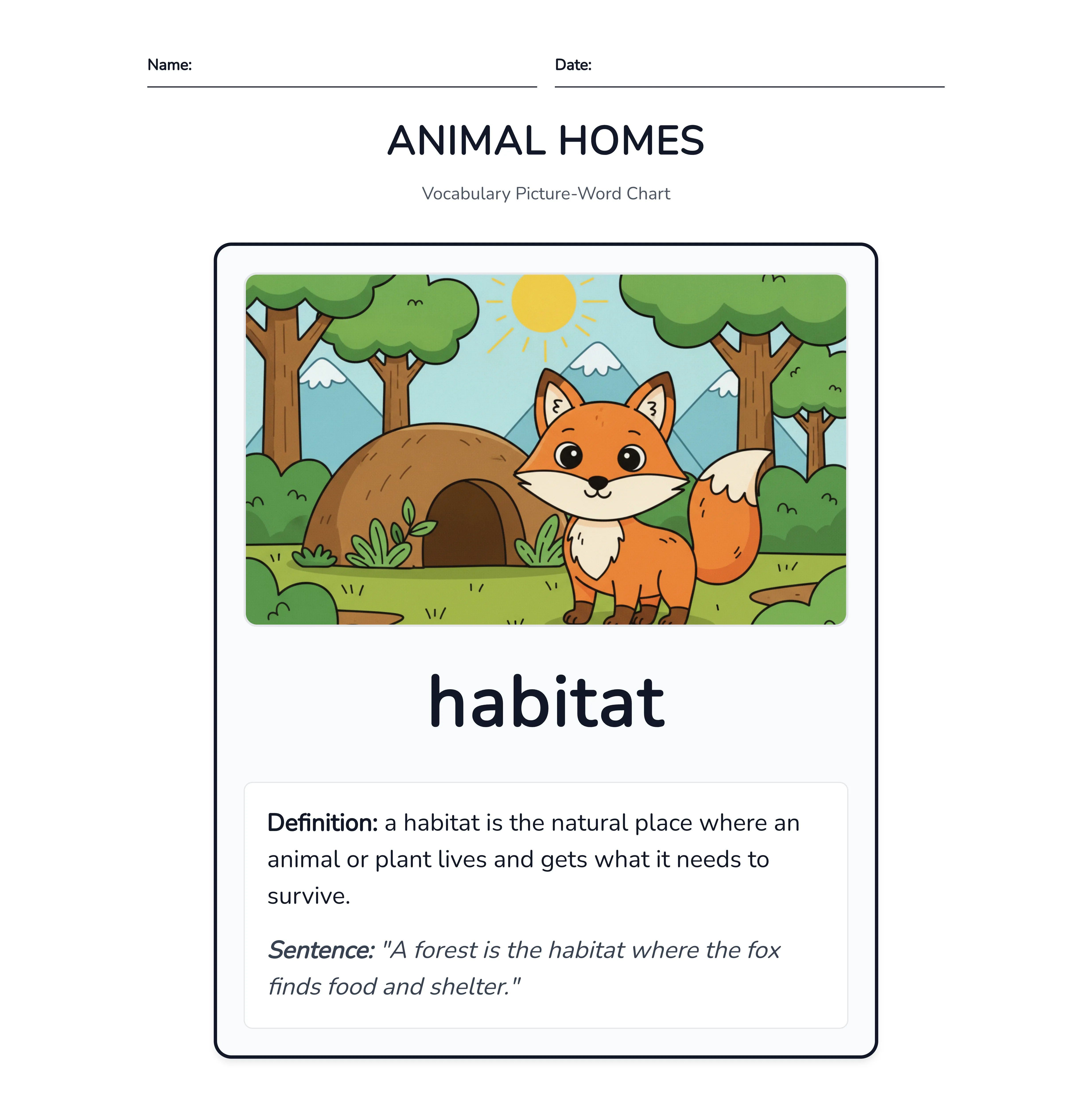
Here's one word shown four ways at once: the word itself, a picture of it, the word used in a sentence, and a plain-language definition. Tying the term to an image and a sentence gives a student more than one way to hold onto it, which makes it a good fit from K-2 up and a real help for early readers and English language learners.
Example
Below is a picture-word chart for "habitat," the word paired with an image, a sentence that uses it, and a definition a student can read on their own.
Get this template
Take the habitat picture-word chart and swap in your own word. If you've got English language learners in the room, you can translate the card into a student's home language so the new word sits right next to one they already know.
How to use a vocabulary picture-word chart
Benefits of a vocabulary picture-word chart
Grade levels and subjects
Ideas in bubbles, joined by lines, and every line carries a label naming how the two ideas it connects relate. That labeling, really, is the whole point of a concept map. It pushes students past "these go together" to saying exactly how they go together. This is also the layout teachers most often mix up with a mind map. The quick difference: a mind map fans out from one central idea in loose branches, which makes it handy for brainstorming, while a concept map links several ideas to each other with those labeled lines, so it's built for showing how a whole system fits together. It's best from about 3-5 up in any subject with moving parts, like the water cycle, a food web, or the branches of government.
Example
This one maps the water cycle, each stage in its own bubble and labeled arrows showing how evaporation leads into condensation and on around.

Get this template
Grab the water-cycle concept map and rebuild it around your own topic. You can pull a blank version that keeps the structure but clears the boxes, so students map the connections themselves instead of reading yours. And if a looser mind map is what you're after, the Custom option builds one from a description.
How to use a concept map
Benefits of a concept map
Grade levels and subjects
Vocabulary sits underneath everything else in this article, when you think about it. A student can't map a story or trace a cause without the words for it first. So spend real time here, on single terms and on the webs they form, and the rest of the thinking the other organizers ask for comes a good deal easier.
The day before a new unit, there's a question worth asking: what do the kids already know about this? Sometimes it's more than you'd guess, and sometimes it's a pile of half-right ideas you'll spend the week untangling. Either way, you want to see it before you start teaching, not after the first quiz tells you. That's the kind of work these last two layouts do. They get what's already in students' heads onto the page, and they move a class from a problem toward something like a plan.
One activates what students bring to a topic before you dig in. The other walks them from a problem through a few options to a solution they can defend. Both are built for the open end of a lesson, the brainstorm and the inquiry, where the goal is thinking out loud on paper rather than landing one right answer. Pick the one that matches whether you're opening a unit or working a problem.
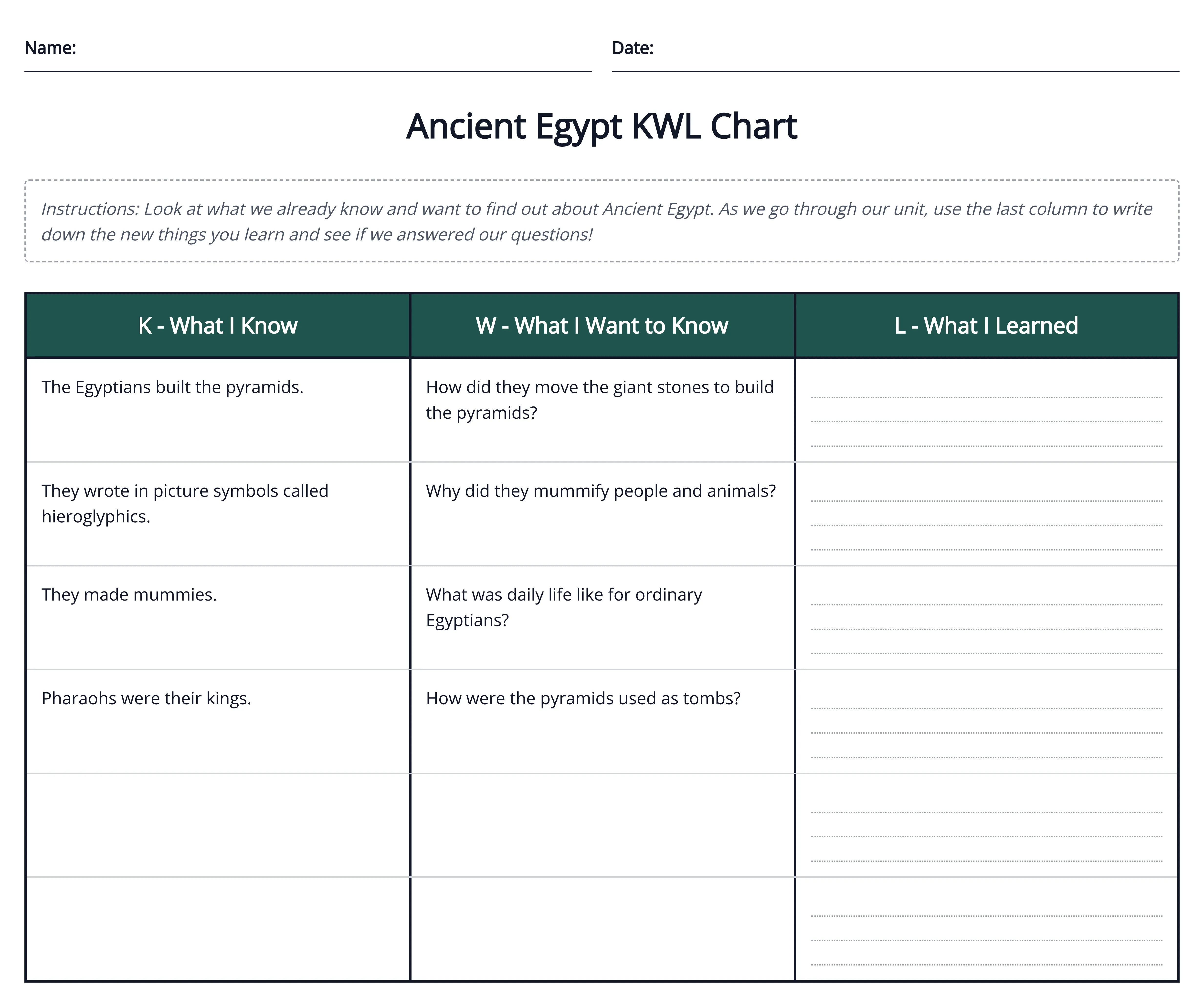
It's three columns, filled at three different moments: K for what students already Know, W for what they Want to learn, and L for what they Learned by the end. You start it before a unit and come back to close it out, which makes it the standard tool for activating prior knowledge and for showing students how far they traveled. It fits from about K-2 up, in science and social studies especially, anywhere a unit has a clear before and after.
Example
Here's a KWL chart for a unit on Ancient Egypt, the Know and Want-to-learn columns filled in from a class brainstorm and the Learned column left open for the end of the unit.
Get this template
Pull up the Ancient Egypt KWL chart and change the topic to whatever unit you're opening. You can send it to Google Classroom so students fill the Know and Want columns the day before, then reopen it to add what they Learned once the unit wraps.
How to use a KWL chart
Benefits of a KWL chart
Grade levels and subjects
A problem stated at the top, the options for solving it laid out in the middle, and the chosen solution at the bottom, with room to say why it won. The real point is the middle: it keeps students from grabbing the first fix that comes to mind and makes them weigh a few before they commit. It works from about 3-5 up, in reading when a story turns on a central problem, and in science or social studies when a real-world issue is on the table.
Example
This one works a real-world problem, plastic ending up in the ocean, with three possible solutions weighed in the middle and one argued for at the bottom.

Get this template
Open the ocean-plastic problem and solution organizer and swap in the problem your class is working on. For older students, you can add detail so each option carries its own trade-offs instead of a single line, which pushes them to argue the choice rather than just name it.
How to use a problem and solution organizer
Benefits of a problem and solution organizer
Grade levels and subjects
That's nineteen named layouts covered, and one option left. But you may have a kind of organizer your class leans on that hasn't shown up in any group so far, a mind map, a tree chart, some format off a worksheet you've held onto for years. I've yet to meet a single gallery that holds every layout a real classroom asks for, and a fixed list of nineteen was never going to be it. That's the gap the last option on the list is built to fill, and it's up next.
Nineteen named layouts cover most of what a classroom asks of an organizer. They don't cover all of it. Somewhere in your files there's probably a format you keep coming back to that isn't on any list, a mind map, a tree chart, that one worksheet you've re-photocopied so many times the lines have gone gray. The twentieth option is built for exactly that.
Custom is the one you pick when none of the nineteen named layouts is the shape you're after. You can describe the layout you want in plain words, say a mind map with a topic in the middle and branches running out, a tree or hierarchy chart, a flowchart, and Monsha builds it. Or you can hand it a picture of one you already like, a format off Pinterest or an old worksheet, and it matches that. Either way the organizer comes back filled in from your own material, not as a blank shell to start over on.
Example
Below is a mind map built through Custom, a central topic in the middle with branches running out to the related ideas. It's the kind of layout the named types don't carry on their own.

Build your own
Open the Custom mind map example to see one, or start from scratch: choose Custom, then either type out the layout you want or use Attach to upload a reference image for Monsha to match. Set the grade and language the way you would for any other type, and feel free to ask for the format you've been printing for years.
How to use the Custom option
Benefits of the Custom option
Grade levels and subjects
Between the nineteen named layouts and this one, there isn't much a classroom could ask for that's actually out of reach. The only thing left is making one, and that part takes a couple of minutes. Hopefully the right shape for your class is somewhere in the twenty. Here's how the whole thing works, start to finish.
Every example above came out of the same tool, and the path from a blank layout to a finished, on-grade organizer is short enough to run during a prep period. Basically, you bring the material, and Monsha builds the layout around it.
Start to finish, it's five steps:
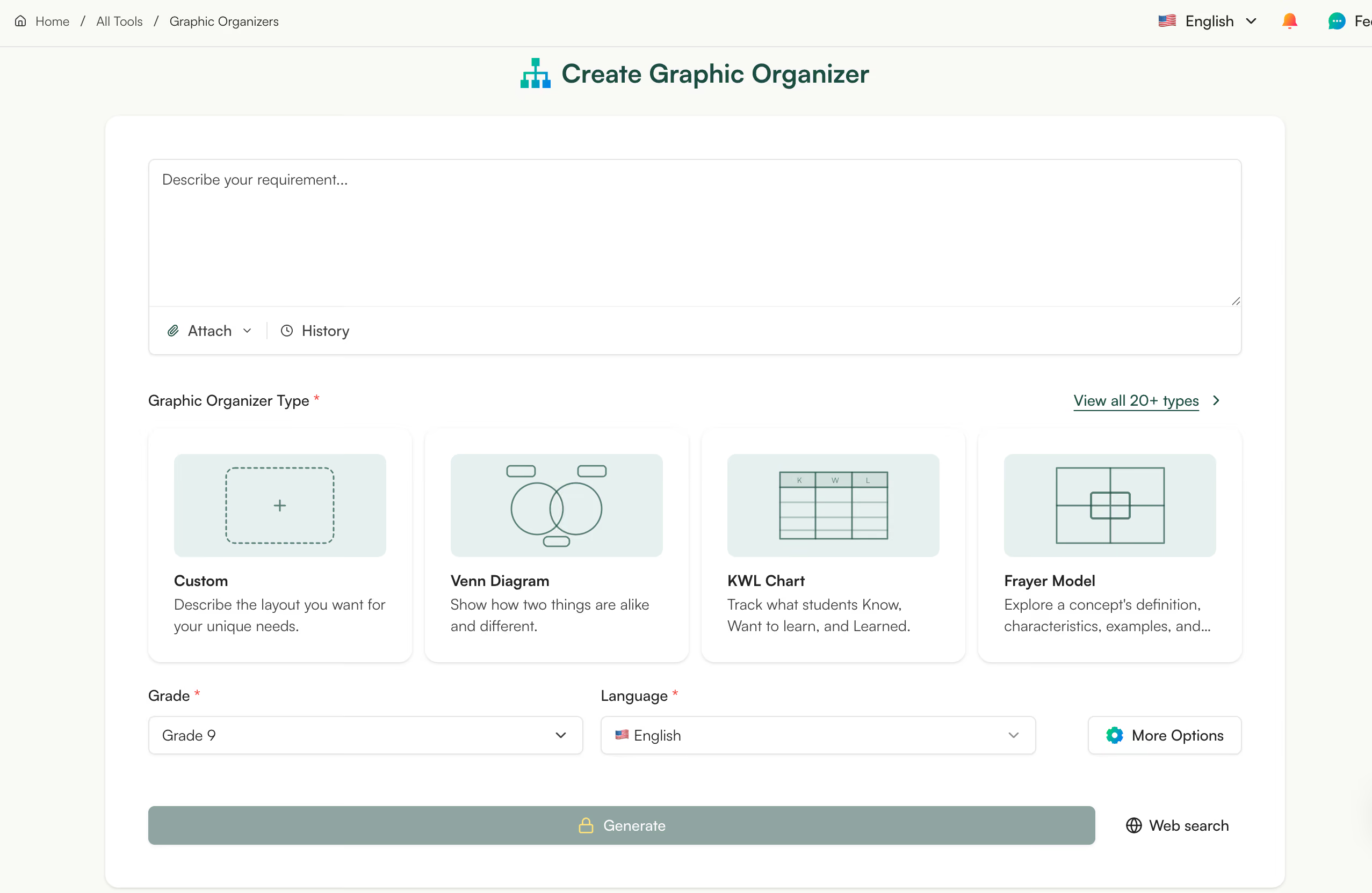
And what comes back isn't a blank template. It's a complete organizer, already filled in from what you gave it, at the grade you asked for. You can edit anything inline, then download it as a PDF or Word doc or send it straight to Google Classroom. If you'd rather build one from scratch, open the tool and start there, and if you want the full walkthrough, here's how to create graphic organizers with AI. Organizers often go out with a matching worksheet, which is where the worksheet generator comes in. And it's free to start.

This is the part most of us still do by hand. You print a master copy, white-out a prompt for one group, pencil in a word bank for another, and reword a question for the student reading two grades below the rest. It works. It's also the copy machine and a marker doing the differentiating.
The one-click version is the same instinct without the re-photocopying. From any finished organizer you can:
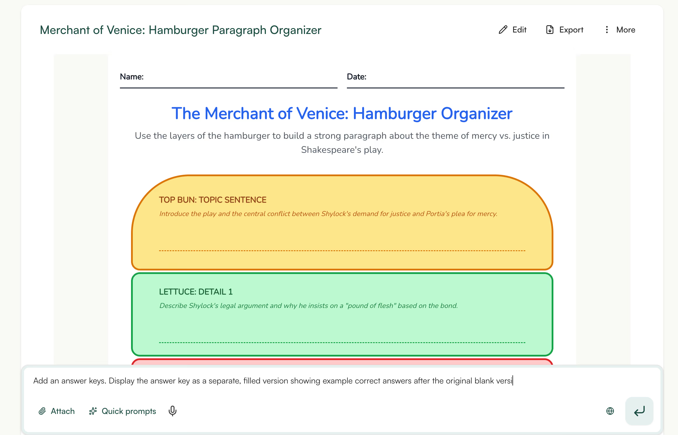
That's one organizer turned into a handful of versions, without another trip to the copier. Pick the type your class needs this week, open its example above, and click Save to My Resources to make it your own.
Really, it comes down to one habit. Pick the graphic organizer that fits the kind of thinking you want from students, comparing two characters, say, or putting a process in order, then start from one that's already filled in instead of a blank you have to build.
For years, that's how most of us got an organizer: track down a template, then do the building ourselves. But every example above skips that step. You can open one, duplicate it to your own account, change the grade and language, and download it. It's free, and you're not rebuilding anything from scratch.
So the next time you've got a lesson to plan for Thursday and a prep period to do it in, you don't have to start from a blank page. The right shape is probably already sitting in one of the twenty above, a couple of clicks from being yours.




AI for Teachers
We’re the Monsha Team—a group of educators, engineers, and designers building tools to help teachers combat burnout and get back to life.. Our blogs reflect real classroom needs, drawn from conversations with educators around the world and our own journey building Monsha.
Join thousands of educators who use Monsha to plan courses, design units, build lessons, and create classroom-ready materials faster. Monsha brings AI-powered curriculum planning and resource creation into a simple workflow for teachers and schools.
Get started for free