Manually creating charts based on a topic can be a challenge. Learn how to make the process easy and manageable with the use of AI.

You know the drill.
You must choose your data, select the data type, adjust the elements, and refine it.
That’s probably your usual process when it comes to creating charts. In case you’ve wondered how AI tools can help you with it, this tutorial is for you.
Instead of detailing every possible way to use AI for charts, we’ll cover only one approach. You’ll find out how easy or difficult the process can be if you just pick a topic and give your AI tool some context about your requirements. The tool can be a traditional chatbot like ChatGPT or an AI graph and chart maker for teachers.

To keep the process manageable, let’s define the scope of today’s tutorial first.
We’re going to create a chart for 7th grade students. The chart will be used as part of a lesson on the Renaissance.
Pretty simple. Well, you can be more specific and narrow down the focus to particular aspects of your topic of choice.
Let’s try the easiest way first and save some time.
1. Head over to Monsha and sign up or log in. (In case you’re not a user, creating an account takes only up to half a minute)
2. Once you're in, you'll see a range of resources you can create—lesson plans, worksheets, questions, and more. Select Graphs, Charts, and Plots.

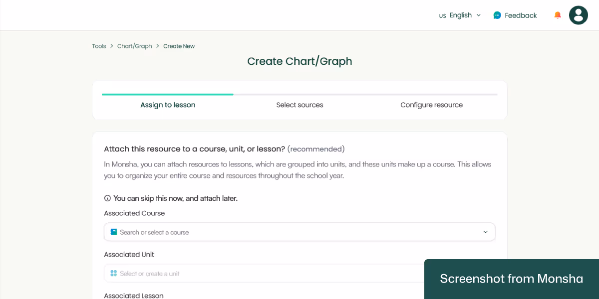
3. You’ll be taken to the chart creation page. Here, you have the option to assign your chart to a course, unit, or lesson. This is a super convenient way for you to keep your resources organized if you plan your curriculum in Monsha. Since we don’t need it today, we’ll skip it.
4. Now comes the interesting part. With Monsha, you can use different sources to create your chart, including file uploads and YouTube videos. You can even combine sources!
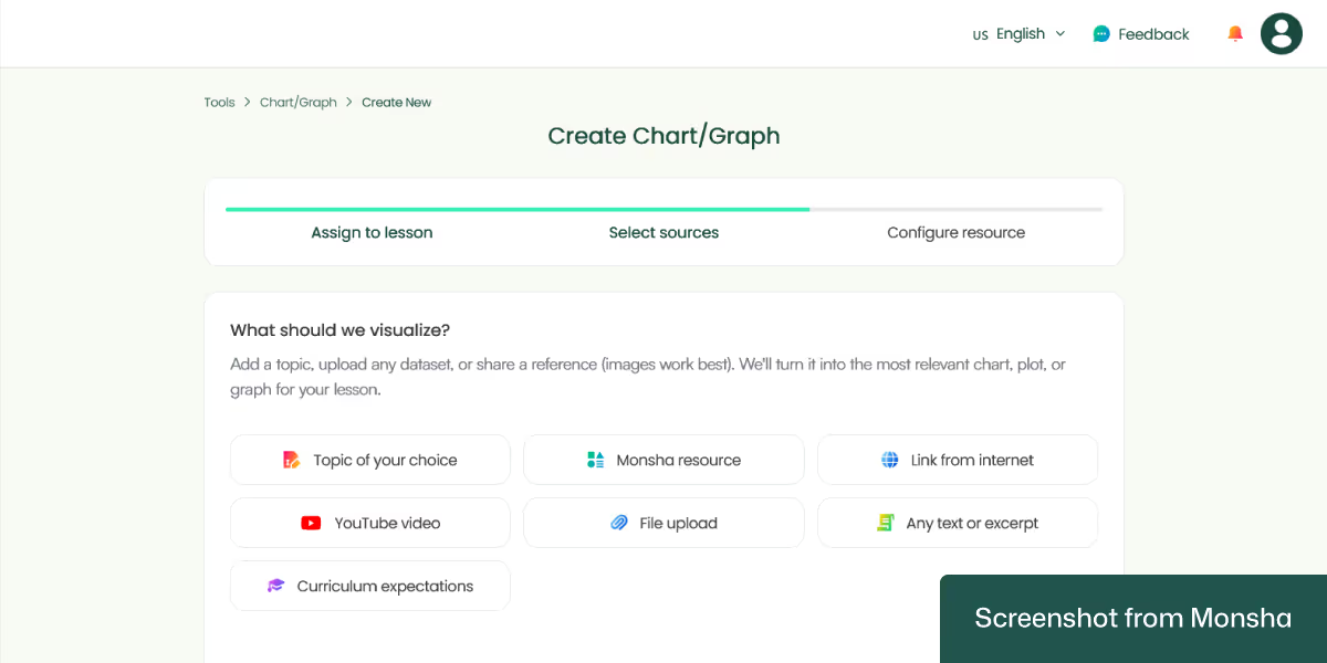
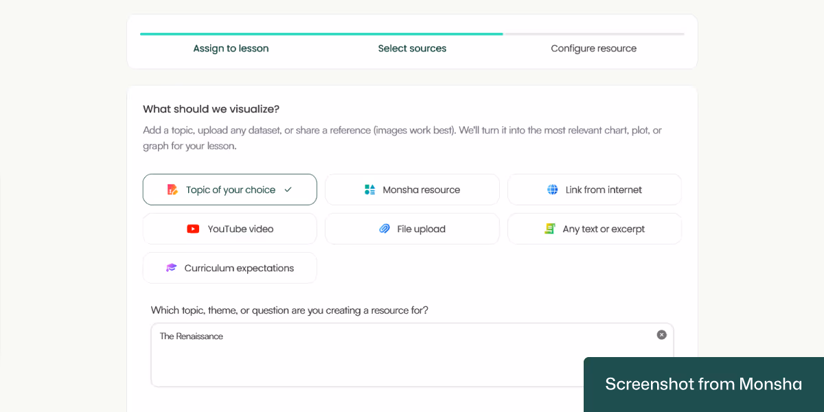
For this tutorial, we’ll need the “Topic of your choice” option. Let’s type in our topic: The Renaissance.
5. On the next configuration screen, we can specify our requirements just by selecting the options we need.
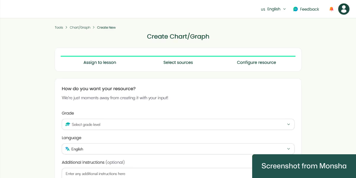
For this tutorial, our configuration is simple.
Grade: Grade 7
Language: English
That’s pretty much it, but you can be more specific by providing additional instructions. So specify the requirements that you couldn’t add in the previous steps. For example, you can tell Monsha what specific subtopics you want the chart to focus on.
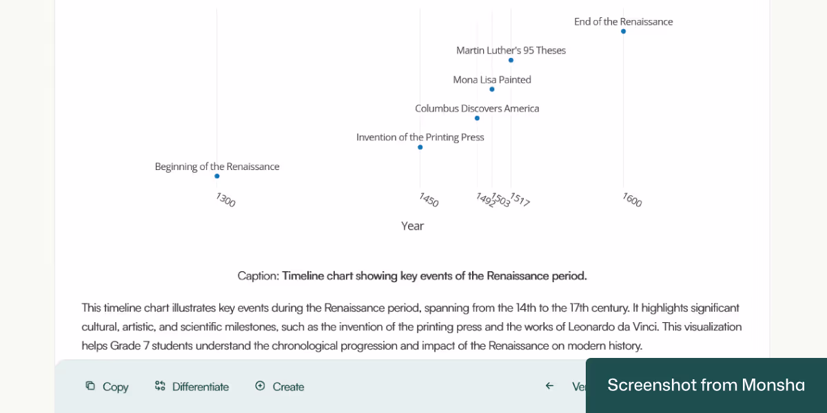
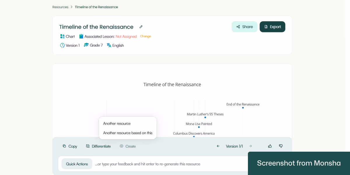
6. Click Generate, and your chart will be ready in seconds! Here’s the result we got.

As you can see, the output has focused on the timeline of the Renaissance, with the following ready-to-use description:
“This timeline chart illustrates key events during the Renaissance period, spanning from the 14th to the 17th century. It highlights significant cultural, artistic, and scientific milestones, such as the invention of the printing press and the works of Leonardo da Vinci. This visualization helps Grade 7 students understand the chronological progression and impact of the Renaissance on modern history.”
Pretty handy.
By the way, while we've focused only on topic-based charts today, you may want to learn how to use AI to generate classroom-ready graphs and charts from any source materials.
Most chart and graph generation tools require a lot of manual work. Besides, they are often designed for general purposes. On the other hand, teachers and educators like you are at the center of everything Monsha does. Just to give you an idea, here’s how you can go beyond creating a chart with Monsha.
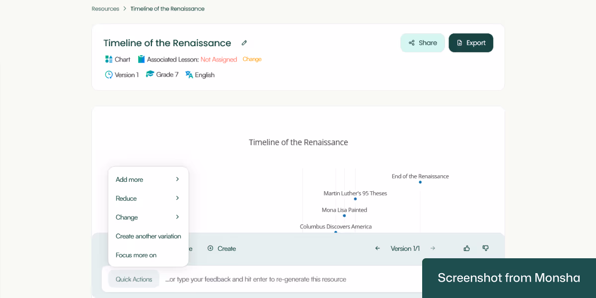
Quickly customize your chart with clicks: Whether you want to add more data points or explanations to your chart, you can do it without any manual edits. The Quick Actions feature does the heavy lifting for you, saving you time.
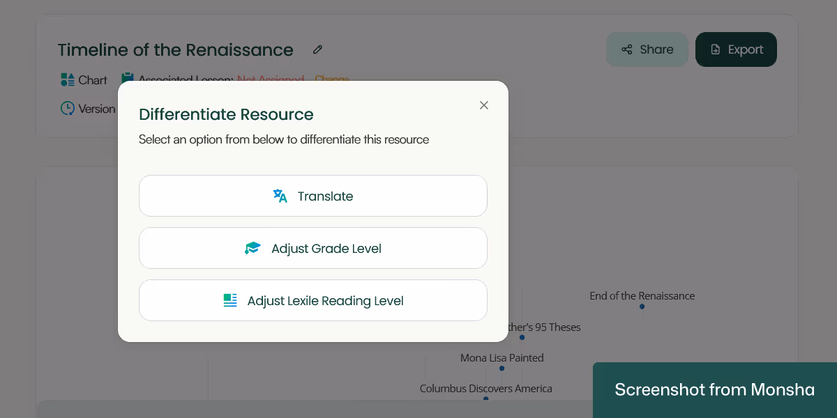
Differentiate for your students: In case you need to develop multiple versions of the same chart for different groups of students, you can do it. For instance, you can adapt your chart based on Lexile reading levels. This is how Monsha makes AI-powered differentiated instruction convenient for you.
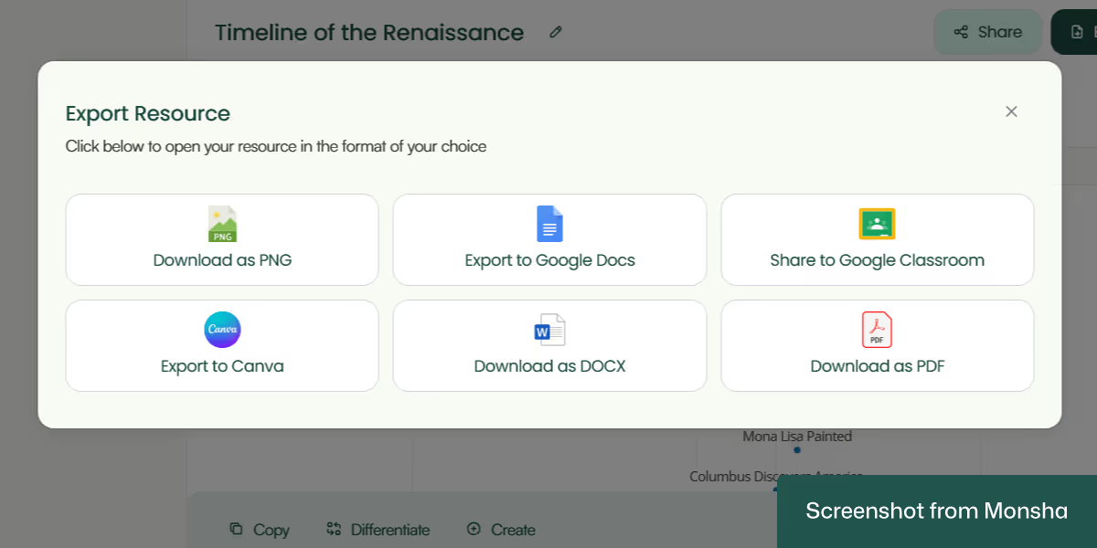
Easy export options: Download your chart as a PNG image or a Doc or PDF file. You can even export it to Google Doc or Canva. Sharing it on Google Classroom is also possible.
Multiple resources based on one material: If needed, you can create more resources directly from the chart you’ve just made. A set of worksheets, for example.
One more thing. All your charts or other teaching materials remain accessible and organized via your Monsha account. So you don’t have to worry about losing track of your resources.

Whether you use ChatGPT or Gemini or Copilot, the process to create a chart based on a topic is fairly straightforward. However, you’ll get better results if you know how to write teaching-focused AI prompts.
Here’s one way to structure your prompt - based on today’s tutorial:
“Create an educational chart for a classroom setting. The chart should be appropriate for 7th Grade students, written in English, and focused on the topic of the timeline of the Renaissance. It should include visual elements (such as icons, color blocks, or simple graphics if applicable), use age-appropriate language, and aim to support comprehension or memorization. The chart should be printable and well-organized for use on a classroom wall or bulletin board. Keep the layout clean and the design engaging for students.”

Let’s explore a few prompt templates and examples. Feel free to customize them to your own requirements. By the way, you can find more specific examples from our AI prompt library for teachers.
"Create a [type of chart] to explain the concept of '[science topic]' for a [grade level] science class. Use simple, age-appropriate language in [preferred language], and include visual labels and brief descriptions."
"Create a labeled diagram to explain the concept of 'the water cycle' for a 5th grade science class. Use simple, age-appropriate language in English, and include stages like evaporation, condensation, precipitation, and collection."
"Generate a [type of math chart/graph] to help [grade level] students understand '[math topic]'. Use clear examples and label all elements in [preferred language]. Make the layout student-friendly."
"Generate a bar graph to help 3rd grade students understand 'comparing numbers using place value'. Use clear examples and label all elements in Spanish."
"Design a [type of map or chart] for a [grade level] [geography/social studies] class to illustrate '[topic]'. Use simple explanations and label key elements in [language]."
"Design a world map with a color-coded key to show continents and oceans for a 2nd grade geography class. Use simple explanations and label key elements in French."
"Make a chart that helps [grade level] students understand '[language arts concept]', such as parts of speech, story structure, or figurative language. Use age-appropriate definitions and examples in [language]."
"Make a chart that helps 4th grade students understand 'types of figurative language'. Include examples of simile, metaphor, personification, and hyperbole in English."
"Design a visual chart for a [grade level] health class explaining '[topic]'. Keep it age-appropriate, use [language], and include pictures or icons if helpful."
"Design a visual chart for a 1st grade health class explaining 'healthy food groups'. Use age-appropriate language in English and include icons for fruits, vegetables, grains, proteins, and dairy."
You probably already know that you should always review AI chatbots’ output. Charts are no exception. In case the result doesn’t match your expectation, you may have to start over, which takes time. How much time? That depends on the quality of the chart. Unfortunately, this process can become unsustainable when you need multiple charts or different types of materials for different classes. If you’re looking for a reliable and repeatable solution to solve this challenge, try Monsha for free.


AI for Teachers
We’re the Monsha Team—a group of educators, engineers, and designers building tools to help teachers combat burnout and get back to life.. Our blogs reflect real classroom needs, drawn from conversations with educators around the world and our own journey building Monsha.
Join thousands of educators who use Monsha to plan courses, design units, build lessons, and create classroom-ready materials faster. Monsha brings AI-powered curriculum planning and resource creation into a simple workflow for teachers and schools.
Get started for free
.avif)
.avif)
.avif)