Easily create well-structured, accurate, and ready-to-export graphs, charts, and plots with the best data visualization tool for teachers. Enjoy precise control and flexibility over the format and seamless alignment with your subjects, grade levels, and curriculum standards.
Monsha makes the process of making graphs and charts flexible, powerful, and refreshingly simple.

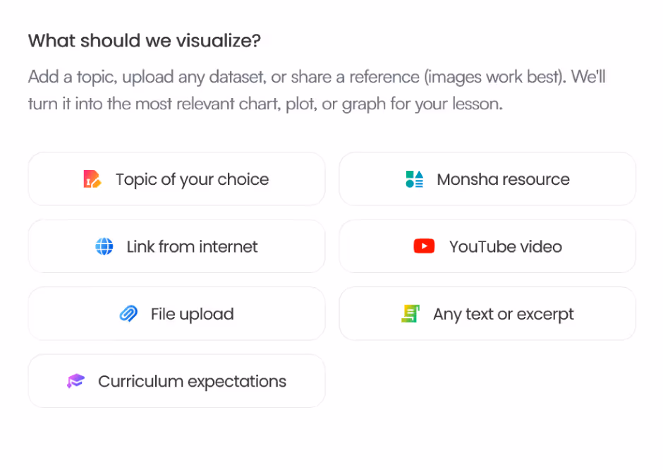
Define what you need — add topics, source materials, select grade level as well as language, and specify other instructions.

Watch Monsha transform your requirements into accurate, engaging, ready-to-use graphs and charts with proper labels, title, and description.

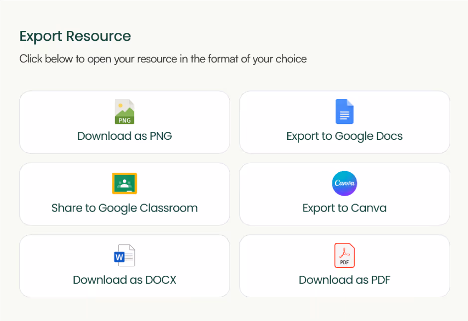
Customize or re-generate until it’s 100% perfect. Differentiate, or create follow-up resources based on the output. Download in PNG, PDF, or other formats, or export to Google Docs or Canva.
Monsha provides a seamless, end-to-end process for creating, customizing, and adapting graphs and charts. Everything you build stays connected and supports what comes next.
Import and re-use your existing materials, notes, external references or just anything to create more relevant, accurate graphs and charts. You can even generate new graphs and charts from existing Monsha resources.

Easily adapt any resource for different students or classrooms. Whether you're translating, adjusting complexity, or shifting focus, it only takes three clicks. No need to prompt or start from scratch.
Get your graphs and charts where they need to be. Export directly to Google Classroom, Google Docs, and Canva, or download ready-to-use files in your preferred format. No manual customizations required before sharing them with colleagues or students.

Go beyond graphs and charts. Create your full curriculum, break it into units and lessons, and build daily plans and resources—all in one place. Everything stays connected for the entire school year, whether you're planning ahead or focused on today.
This graph and chart maker is part of the AI tools created for teachers by Monsha. Whether you're an experienced educator or a new teacher, you can use Monsha as the all-in-one hub for curriculum and lesson planning, daily teaching resources, and quick differentiation.
Try it nowGraphs and charts make data easier to understand. They can help your students visualize complex information, spot patterns, and draw conclusions. These skills are essential in a range of subjects, including math, science, social studies, and even language arts.
The best type of graph depends on what you're teaching. If you're showing comparisons, a bar chart is usually the easiest for students to understand. Line graphs are great when you want to show changes over time, like tracking temperatures throughout the week. Pie charts help students see how things fit together as parts of a whole; perfect for topics like fractions or survey results. For more advanced learners, scatter plots can demonstrate relationships between variables, like study time and test scores.
What challenges do teachers face when making graphs and charts?
One of the biggest challenges is time. You’re already juggling lesson plans, grading, and classroom management. On top of that, designing clean, clear visuals can feel overwhelming, especially if you don’t have design software or the technical know-how. It can also be tricky to align the visuals with your grade level, subject, and curriculum standards while keeping the material age-appropriate and engaging.
What should I consider when creating graphs for younger students?
When working with younger learners, simplicity is key. Choose bright colors, use large text, and keep the number of data points low. Real-life examples, like graphing favorite ice cream flavors or the number of pets in the class, make the activity more meaningful. Always walk your students through the parts of the graph, such as the axes and the data labels. This will help them feel confident interpreting it.
What are best practices for using graphs and charts in the classroom?
The most effective way to use a graph in class is to connect it directly to your lesson. Start with context. Tell students what the graph is about and why it matters. Then guide them through it by asking questions like, “What do you notice?” or “What does this tell us?” Use real or relatable data when possible, and encourage students to create their own graphs as part of the learning process. That builds data literacy and critical thinking.
Can I reuse the graphs and charts I make across different subjects?
Yes, and this can actually help reinforce skills in multiple areas. For instance, a bar graph showing students’ favorite foods could be used in math to discuss percentages, in language arts to inspire opinion writing, or in health class to talk about nutrition. Once you’ve created a strong visual, think about how else it might fit into your curriculum.
What mistakes should I avoid when making graphs?
Some of the most common mistakes include trying to fit too much information into one graph, using confusing color schemes, or forgetting important details like a title, axis labels, or units of measurement. You also want to be sure the data you’re using is appropriate for your students’ age and skill level. A cluttered or overly complicated graph can do more harm than good.
Are there tools that can make creating graphs and charts faster for teachers?
Yes, and many of them are very user-friendly. Programs like Google Sheets, Excel, and Canva allow you to quickly input your data and turn it into a visual. Better yet, there are now AI-powered tools that can generate polished graphs and charts from just a few words or a simple data set. These tools are designed to save you time while still producing high-quality, classroom-ready visuals. Monsha's AI graph and chart maker is one such powerful tool. It has been designed for teachers and educators like you so that you can quickly and reliably create different types graphs and charts.
How can AI help me create charts and graphs?
AI tools can be a game-changer in your prep time. They can help you with graphs and charts based on your instructions. Try something like, “Create a line graph showing class attendance over five weeks”, and the AI will automatically generate it for you. However, to get the best output, you should provide your classroom context in your AI prompts. Some teaching-focused AI tools like Monsha can also recommend the best chart type based on your data, label everything correctly, and make the graph look age-appropriate. It’s like having a digital assistant that understands what teachers need.
How can I make sure my charts match curriculum standards?
Start by thinking about the skills your standards ask students to develop. If your curriculum includes interpreting data, averages, or probability, choose or create graphs that support those goals. Many AI tools and digital platforms now allow you to tag or filter your visuals based on curriculum standards like Common Core or NGSS, helping you stay on track while saving time. For example, with Monsha, you can set your curriculum expectations with a few clicks.
How can I use AI to quickly create graphs and charts for my class?
The fastest way is to use a free AI tool that lets you describe what you want in plain language. For example, if you write “Create a pie chart of classroom pets: 10 dogs, 5 cats, 3 birds, 2 rabbits,” the AI will instantly turn that into a neat, colorful graph. You can download it, print it, or add it directly to a digital slide. It’s simple, time-saving, and perfect for busy teaching days. However, keep in mind that you must be more specific about your prompts if you want to generate curriculum-aligned graphs and charts with AI.
How can teachers get started with Monsha’s AI-powered graph and chart maker?
To begin, create a free account on Monsha. Navigate to the Graphs, Charts, and Plots tool and input your requirements, such as topics, grade level, or source materials. The AI will generate a tailored chart/graph that you can review, customize, or differentiate further to suit your classroom needs.
Can Monsha help differentiate graphs and charts?
Yes, Monsha can help you differentiate graphs and charts. It can adjust complexity for advanced learners, simplify language for students needing extra support, and modify formats for a variety of learning styles. Its in-built support for frameworks like Bloom's taxonomy, Depth of Knowledge (DOK) levels, and Lexile levels makes the entire process easy for you. Customizing your graphs and charts based on grade level or language is also possible. You can even set completely new differentiation requirements.
Can Monsha generate relevant classroom resources based on my graphs and charts?
Yes. Monsha can create any type of teaching resources based on your graphs and charts. Lesson plans, worksheets, quiz questions, and presentations, for example.
Palm Beach County School District, Florida

I’ve been speaking to everyone about the ease of your site. I enjoyed the fact that there were different question types and that you were able to modify the question levels or styles without much effort. Using it almost every day to redo and update assignments.
I really am enjoying Monsha and can’t wait to spread the word about it.
Central Holmes Christian School, Lexington, MS
I use Monsha a lot. Sometimes I even feel like I’m bothering y’all with how often I’m on it 😅 but I really appreciate this app so much. Even during summer break, I’m using it to get ahead on lessons for next year.
Ohse Home School, Oklahoma
I love this platform - this has made homeschooling easier for me from planning lessons to creating spelling, reading and English worksheets.
It's been a life-saver for my school year no matter what your religion may God bless you all!
Zenith International School, Malaysia
Your presentation content is great based on the pdf file I provided. I teach maths in my case i needed to make presentation more interesting for the kids, not boring blank pages with text. Like artworks, graphics or real images that relate to my subject. Thank you for that 😍
Professional Learning Developer
This tool is fantastic! This really makes it more of an all-in-one-stop shop for me now that you've added the PPT tool upon my request.
It is very intuitive as far as the prompt is concerned. And I like the options to add links, content, previous resources, and especially the YouTube feature.
High school math teacher in the US
The worksheets look great. Thank you so much for taking care of this, it's so rare to find a resource that works with latex for math! I'm thrilled!
Khuangnapittayakun School, Thailand
I can create an entire course to include grading rubric within minutes when before it would take me weeks.
In S.E. Asia, the resources are whatever teachers can pirate but Monsha has changed that for me.. now I can create and enjoy the task for a change.
Italian teacher and trainer
Monsha was a wonderful discovery, and I always recommend it in my AI training courses!
The tools they offer are all very effective, but my favorite is "Comprehension Questions," one of the best I've tried across various platforms! Great work!
Maths Teacher, The Teach for Nigeria
I've shared this tool to my colleagues here in Nigeria and they are already falling in love with it.
I actually do use Monsha for everything. From baseline assessment to lesson planning to formative evaluations and of course to summative assessment.
English Teacher, Educación de la prov. Argentina
I was fortunate to chat directly with you guys (creators). Every suggestion I shared was received with enthusiasm, you worked on it and got back sincerely.
I have been impressed with how you improve it based on the actual needs of educators. And kept it clean and simple.
Join thousands of educators who use Monsha to plan courses, design units, build lessons, and create classroom-ready materials faster. Monsha brings AI-powered curriculum planning and resource creation into a simple workflow for teachers and schools.
Get started for free